It’s spring, which means it’s baseball season! Sports fans and fashion fans that we are, we always keep an eye on changing uniform designs, making certain to keep track of the kinds of changes, good or bad, that appear in those erstwhile duds. After all, a team’s entire character can be truly defined by the look they sport. And while some… Recent changes haven’t… Been very positive (*cough*2012 Miami Marlins uniforms*cough cough!*)… And baseball as a whole, unlike football, rarely changes their looks, there were still a few changes to make note of as the season opened on Sunday. Let’s take a quick look, ignoring extremely minor changes, like the Cleveland Indians changing what they identify as their primary logo, but not actually changing their uniforms. We’re only looking at the major new uniforms, pretty much all of which are new “alternate” uniforms.
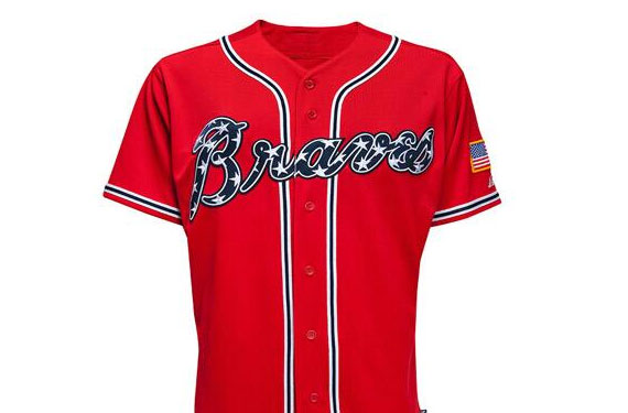
Atlanta Braves
 This is the new Braves alternate uniform, called the “military appreciation” jersey. Red has always been part of the Braves color scheme, but this one is unique because it ditches the iconic tomahawk from the Braves logo, and adds a patriotic flourish of stars inside the logo script. We like it! It’s a bit garish for our tastes, but not too much (*cough*2012 Miami Marlins uniforms*cough cough!*), and in such a staid and old fashioned league like MLB, a splash of color is appreciated. Salute!
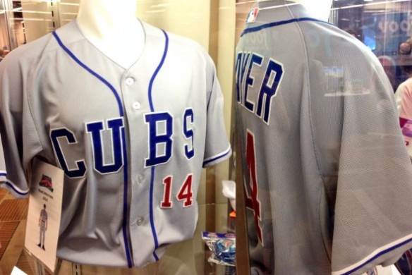
Chicago Cubs
The Cubs actually introduced a ridiculous ten alternate jerseys to be used this season, but this one is out favorite, the “main” alternate road jersey. It’s a total throwback to the Cubs’ looks from the 1920s, a golden age for baseball, and just reeks of the history and American-ness of Major League Baseball. Just wonderful.
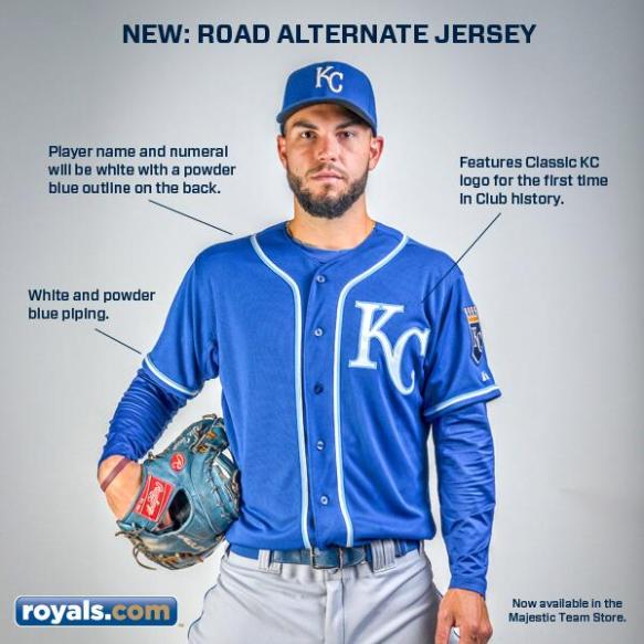
Kansas City Royals
The Kansas City Royals rolled this beauty out recently, and we really love it. It makes great use of the Royals’ colors, and features the team’s “KC” logo for the first time on the actual uniform. Unlike a lot of alternate jerseys, which try their hardest to look “weird,” this one looks like it could have been the actual Royals uniform in another timeline. The blues and piping just look perfect.
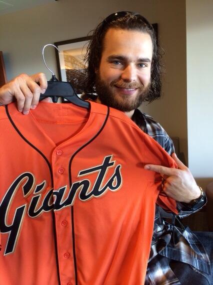
San Francisco Giants
Another winner, this alternate jersey uses the Giants’ orange color to good effect, but the real winner here is the throwback script and black piping, which haven’t been seen in a Giants uniform since 1982. A great combination of modern and classic, exactly what an alternate uniform should be.


