Today, we are going where no fashion blog has gone before: directly into nerdiness. We’ve talked about future fashion in science fiction once before, but that was a look at overall fashion senses in different visions of the future. This time, we want to take a look at one fashion future in particular, and the timing of this blog should give you a hint…
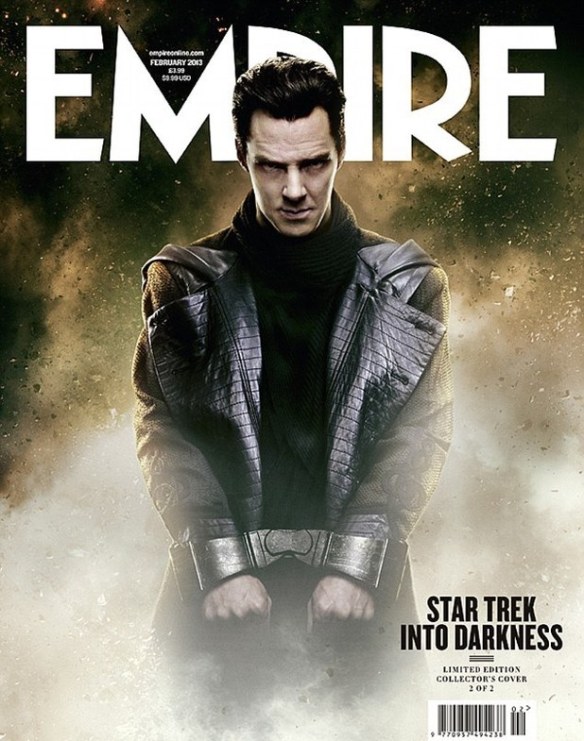
Scary leather is apparently IN for the summer of 2259.
Yep, “Star Trek” fashion. But not just any “Star Trek” fashion… The Original Series was packed full of insane visions of future fashions for civilians, especially some amazingly crazy, but often incredibly sexy, women’s clothes. But we’re interested in SUITS, something you don’t see much of in “Star Trek.” And after the Original Series, fashion takes a decided backseat. But one thing that always showed up, and changed a ridiculous amount of times, were the venerable Starfleet uniforms.

“Semper exploro” should maybe be “semper mutans vestem” in this case…
The Federation Starfleet goes through more changes of clothes than Carrie Bradshaw does in “Sex and the City.” We could go on forever about all the variations in uniforms, but let’s take a look at the main highlights across the nearly 50-year franchise…
2135 – Late 2100s
Jumpsuits, jumpsuits, jumpsuits. And zippers galore. When “Star Trek: Enterprise” (2001-2005) came on the air in 2001 as a prequel, the producers wanted a “Right Stuff” feel for the early pre-Federation Starfleet, so to NASA fatigues they went. There were some clever uses of Windsor-knot ties in the Admiral uniforms, and these have the distinction of being the only “Star Trek” uniforms with pockets, absurdly enough!
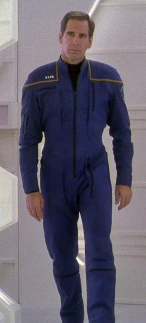
Duty uniform, Command Division
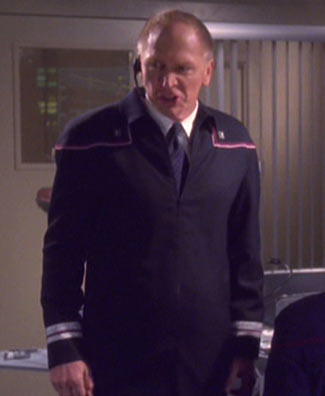
Flag Officer uniform
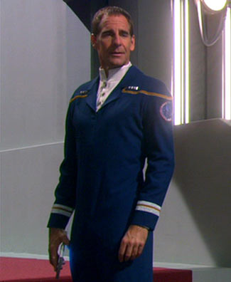
Dress uniform
Early 2200s – 2240s
We love these. They were deliberately designed for the prologue of the film “Star Trek” (2009) as an homage to the space uniforms of ’50s and early ’60s sci-fi, like “Forbidden Planet.” The belt is a great touch. But you’d better be in shape to wear one of these, judging by how form-fitting they are!

Duty uniform, Command Division
2240s – 2265
Oh, dear… Bland colors, really obtuse zippers on the side of the neck, and very cheap-looking fabrics. These early uniforms, made for the two “Star Trek” pilots in 1964 and 1965, were the bad side of that retro sci-fi look we liked.
Duty uniforms, Command Division
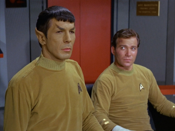
2265-2270
Now we’re talking… Velour? Check. Bright, primary colors? Check? Bell-bottom pants? check. Insanely short skirts on the female uniform? Check, and kind of ridiculous, but what the heck. These are the classics, the uniforms from the Original Series (1966-1969) and the Animated Series (1972-1973). Do they look a little like pajamas? Sure. But they’re functional, simple, get across rank, Division and assignment in an incredibly elegant, simple fashion (gold for Command, blue for Sciences, red for Operations, with a modified version of the U.S. Naval rank stripes on the sleeves, and different emblem shapes for assignments). And how can you not love the high, black leather boots?
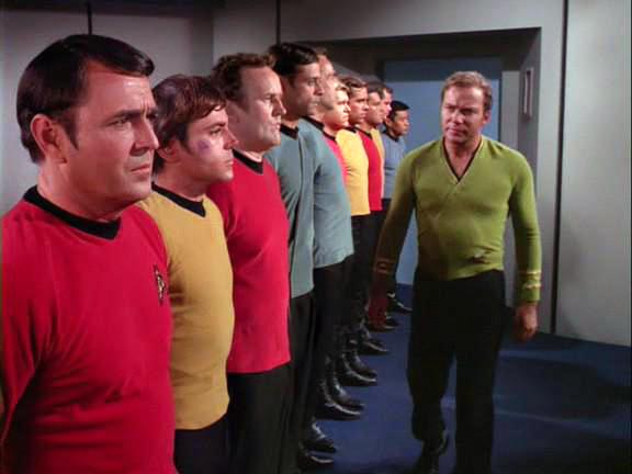
Male duty uniforms, all divisions, and CO’s “wraparound” uniform
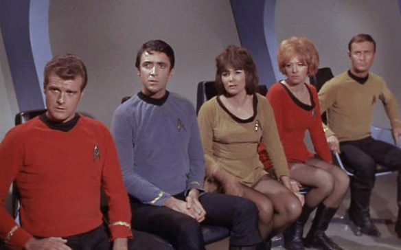
Male and female duty uniforms, all divisions
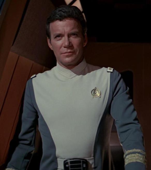
2270-2278
Oh, no… The dreaded “penguin grays.” Sometime in the 1970s, everyone somehow forgot how colorful the Original Series was, and came up with these abominations for “Star Trek: The Motion Picture” (1979). Bland, drab pastel colors, and that bizarre belt buckle (supposedly a “life support monitor,” for some reason)… And SPANDEX EVERYWHERE. Stephen Collins, who played Captain Willard Decker in the film, once said of these things that… Well… Let’s just say that sitting was a painful proposition for the male actors. We like the Admiral uniform, though, and they get points for sheer variety of uniform types.
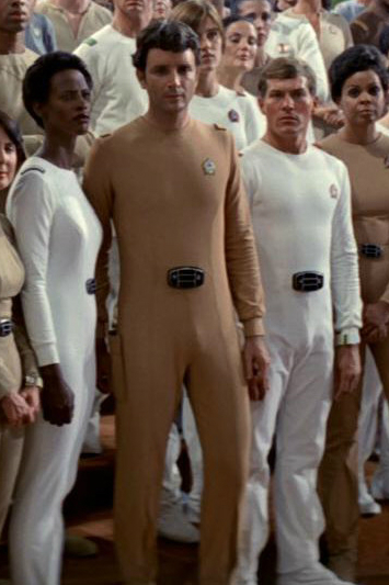
Duty uniforms
Flag officer uniform
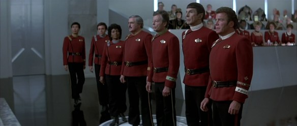
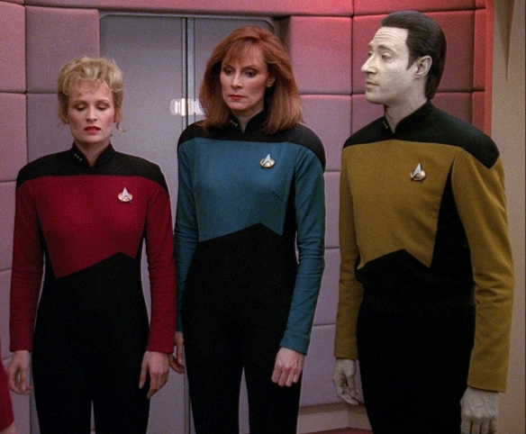
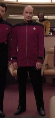
2278-2350
Our favorite of the bunch, these maroon, Teutonic beauties were made for “Star Trek II: The Wrath of Khan” (1982), in order to grab a hold of the color of the Original Series, as well as bring a certain “Horatio Hornblower” naval flair to the franchise. These were easily the most well thought-out uniforms, with a detailed series of rank insignia, service pins, a huge array of Division colors (seen in the collar and insignia straps), special away team jackets, and separate designs for enlisted crew, medical staff, engineering staff, and more. This was the first time in the franchise that Starfleet actually felt like a real, breathing military organization. So popular were these, they were used again in “Star Trek III: The Search for Spock” (1984), “Star Trek IV: The Voyage Home” (1986), “Star Trek V: The Final Frontier” (1989), “Star Trek VI: The Undiscovered Country” (1991), and the prologue of “Star Trek: Generations” (1994). They also showed up in flashbacks throughout the series set in the late 24th century, featuring an alteration of the undershirt from a turtleneck to a crewneck somewhere around 2325. Heck, they’re so good, even in the fictional “Star Trek” universe, they were in service for an insane 72 years!
Duty uniforms and Flag Officer uniform (foreground, note the gold striping), multiple divisions
Duty officer uniform, open, Sciences Division

Duty officer uniform, crewneck variation, Engineering Division
Enlisted crew uniforms, Trainee and Security Divisions
2350-2365
You’d think they would have learned their lesson from the 1979 model… Made for “Star Trek: the Next Generation” (1987-1994), they went back to the spandex, complete with an ugly zipper line in the front. We like hiding the Starfleet emblem in the color pattern of the uniform, and the return to a three-color division system. But otherwise, ugh. And according to Patrick Stewart, they were murder on backs since they compressed everyone into them! Don’t even get us started on the cheerleader-like “skant” uniform…
Duty uniforms, Operations Division
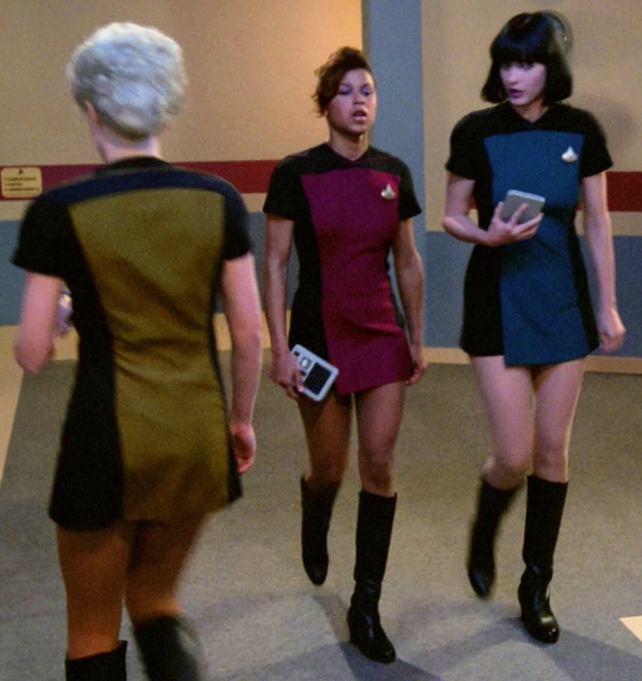
“Skant” variant uniforms, all divisions
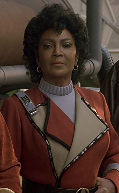
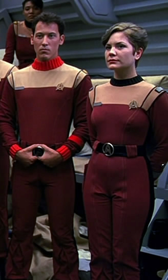
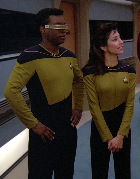
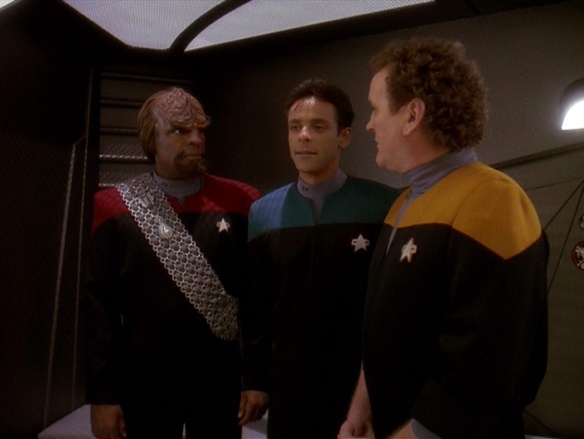
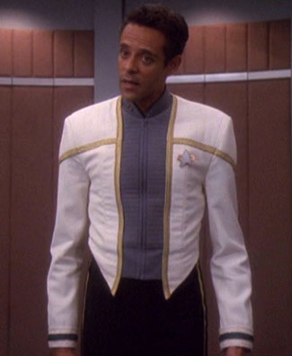
2365-2373
An improvement, to be sure! This was an effort to take the earlier TNG uniforms, and make them look like actual uniforms, as well as make them a lot more comfortable to wear for the actors. The male uniforms switched to wool, and the zipper was moved to the back. No longer form-fitting, and with a rank collar, these were much more dignified. The “casual” jumpsuit variant, on the other hand, introduced for “Star Trek: Deep Space Nine” (1993-1999), and also used in “Star Trek: Voyager” (1995-2001), is dull, dull, dull. These things had stirrups slung under the boots to keep them taut, leading “Voyager” actor Robert Beltran to remark, “they just make you sag…” Not a good idea.
Duty uniforms, all divisions
Flag Officer uniform, Command Division
Jumpsuit variation, all divisions
2373-2390s
Still jumpsuit-like, but far more staid and uniform-like. We approve. The grey shoulders look good, as does the ribbed fabric. Created for “Star Trek: First Contact” (1996), and also used in “Star Trek: Insurrection” (1998), “Star Trek: Nemesis” (2002), and the later seasons of DS9, there’s not much to say on this one, except that we love the Admiral uniform’s Federation Seal belt buckle.
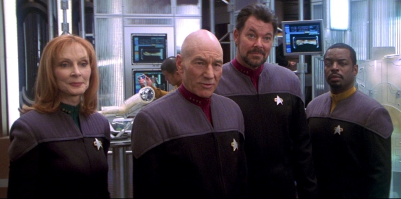
Duty officer uniforms, all divisions
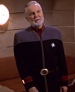
Flag Officer uniform, Command Division
Dress uniform, Sciences Division
Alternate 2250s and 2260s
Made for the new “Star Trek” (2009) movie and “Star Trek Into Darkness” (2013), these are straight-up an updated version of the classic Original Series uniforms for the “Alternate Reality” the new movies take place in. The fabrics look very high-quality and comfortable, and the inclusion of the Starfleet emblem in the fabric is a very nice touch. Wonderfully retro and futuristic at the same time. And the dress uniforms are great, straight out of a 23rd century West Point!
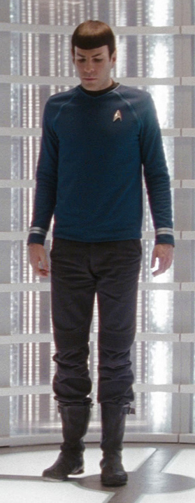
Male duty uniform, Sciences Division
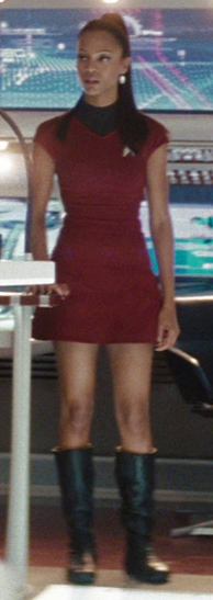
Female duty uniform, Operations Division
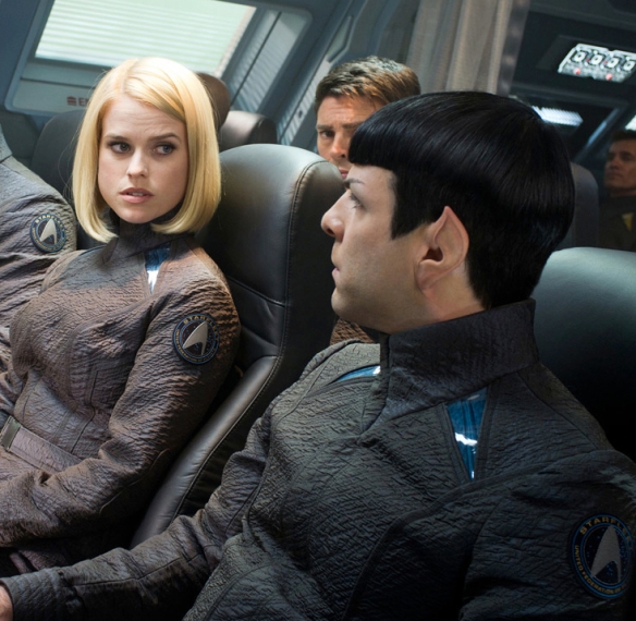
Flight jumpers
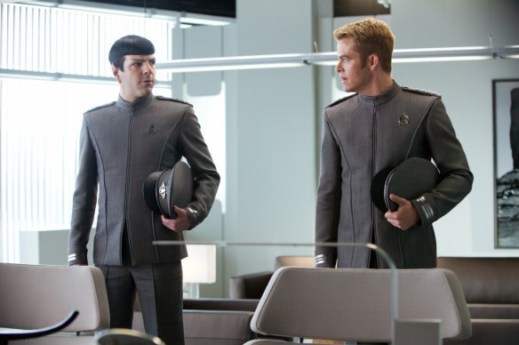
Dress uniforms
There’s more than these, of course, from the infamous evil “Mirror Universe” uniforms (bared midriffs galore), to uniforms from alternate realities and possible futures, but we’ve gone on long enough! We hope you’ve enjoyed this look at the fantastical, because next time we’re coming back to Earth. See you then!
 This is the new Braves alternate uniform, called the “military appreciation” jersey. Red has always been part of the Braves color scheme, but this one is unique because it ditches the iconic tomahawk from the Braves logo, and adds a patriotic flourish of stars inside the logo script. We like it! It’s a bit garish for our tastes, but not too much (*cough*2012 Miami Marlins uniforms*cough cough!*), and in such a staid and old fashioned league like MLB, a splash of color is appreciated. Salute!


