It’s the height of the football season, so let’s take another quick trip into the world of the NFL. The last couple of times we were here we took a look at some of the more questionable design choices of the current NFL…
No comment.
What about logos, though? Those contribute just as much to the overall “feel” of a team’s image as the uniform designs themselves do. The NFL is very good at logo continuity and integrity, especially compared to some other leagues.

We’re looking at you, NHL.
But what about the logos that we almost got? The lost logos of the NFL, if you will? …Well, let’s just say there was a reason they were lost.
Seattle Seahawks
Seattle’s less-than-threatening mascot, a sea hawk, better known as an osprey, never lent itself well to logo design with its small head and ruffled feathers.
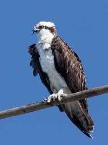
Less “scary football player,” more “eccentric college professor.”
The Seahawks did their best with this slightly sleepy looking osprey head for many years, mostly relying on the strength of their great color scheme to get by.
 In 2002, the team decided to do a makeover to bring the logo more in-line with modern team logos. They came up with this:
 An improvement to be sure, with the osprey looking genuinely ready to kick butt. Ultimately, they rejected it, opting instead to go with this…
 Otherwise known as the exact same logo with a different helmet color. Well, not all of these are going to be that drastic, right? After all, NFL teams aren’t crazy. They wouldn’t go completely off the deep end, right?
Indianapolis Colts
…Okay, maybe they would. For many, many years, this has been the logo of the Colts, both in Baltimore and in Indianapolis.
 For the 2001 Season, the team wanted something new, something exciting, something that just screamed “Indiana” and “Indianapolis” and “not hideous.” How could they go wrong, with one of the simplest, cleanest logos and color combos? They couldn’t possibly muck this one–

AHHHHHHHHH!!!! KILL IT WITH FIRE!!!!
What the heck are we even looking at here?? The blue has gone purplish, the font design is lifted from a cereal box, and the horse head is some sort of terrifying, abstract Picasso-esque monstrosity! What were they thinking? Thankfully for everyone, the Colts didn’t go with this, instead choosing the following update:
 A new, slightly darker blue. Don’t mess with success, people.
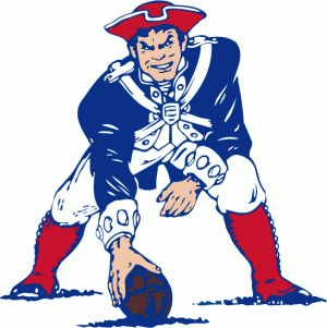
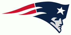
New England Patriots
The Pats used to have a rather busy logo for their first few decades…
 They didn’t replace it until 1996, but in 1978, someone in New England got the idea to toy with the logo. After several different versions, here’s what the team almost went with.
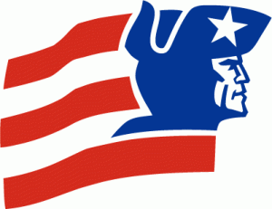 Not bad, and definite shades of what they chose later…
 But it looks more like a logo for a special branch of the US Postal Service than a football team. Pass.
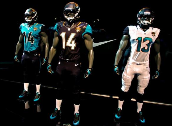
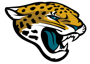
Jacksonville Jaguars
Oh, poor Jacksonville, here you are again. Before deciding on the Jaguar head for the logo in their inaugural 1995 Season, the Jags had an entire logo and uniform set all ready to go from 1993 to late 1994 featuring a very different Jaguar…
 A bit minimalist, and darker, without the aqua in the later logo. We rather like this one, actually, and considering the extreme “’90s-ness” of the one they eventually went with…
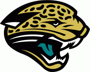 And then updated this year…
 We kind of would have liked to have seen how that other, more dignified logo would have fared over the years.
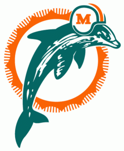
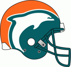
Miami Dolphins
The Miami Dolphins started out with another AFL-staple clearly hand-drawn logo design, which they kept through the 1996 Season.
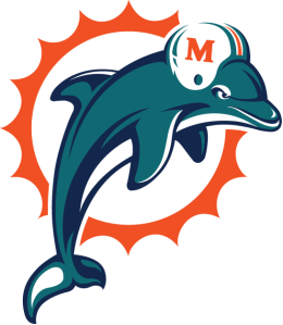
 For 1997, the team finally wanted something new. This… This is what they came up with.
?????
Uh… Well, if we’re talking airline livery… Circa 1981… Sure, good design. But for an NFL team? It looks like they swiped it from the dolphin enclosure at SeaWorld. The logo was outdated the moment it was designed, and accentuates the orange and aqua of the Dolphins logo over the much more prominent and well-known lily-white. The team scrapped it, opting instead to update its existing logo, making the titular dolphin more three-dimensional, well-defined…
..And crankier, apparently.
This year, the team went back to the abstract, with a logo that… Looks more like the scrapped 1997 logo, actually.
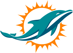
Fly Dan Marino Airways!
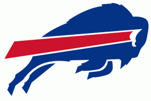
Buffalo Bills
The Bills logo has been the same since 1974. This familiar, sleek, and very functional design, that was actually rather ahead of its time in terms of logo design, looking for all the world like a logo from the late ’80s or early ’90s.
 In 2002, the team tried to finally swap it out with a new logo, one that was less abstract, and referenced the “B” in “Buffalo Bills.”

Is it just us, or does this look like the logo of an investment firm?
It’s probably for the best that they stuck with the old logo…
San Francisco 49ers
You may know this logo well, it or some slight variation on it has been the 49ers logo for basically forever.
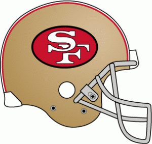 Did you know that in 1991, the team changed it, even going so far as to make entirely new helmets, and introducing the new logo and helmets at a press conference before the 1991 Season? Why haven’t you ever heard of this?

This is why.
Yeah, the Bay Area basically went insane, demanding it be changed back. The response was so overwhelmingly negative, the team did so just days later.
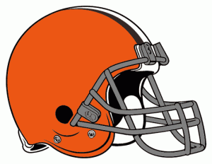
Cleveland Browns
Oh, my, where to start? The Browns have never had a true logo, per se, always just being represented by their helmet, in one way…
 Or another…
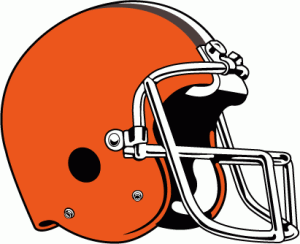 Or another…
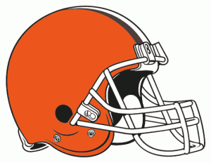 Oh, come on, really?
 The Browns have always had secondary logos, though, that served as something, anything, to put on products and flags for the fans, like… Uh, “Brownie the Elf”? What the heck?

Pictured: your childhood nightmares.
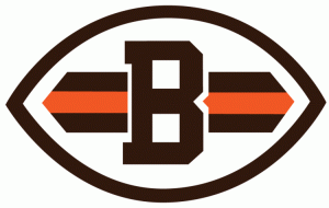
And then a “B” in a football…
 And then a… Dog face? Because of the “Dawg Pound,” whose name has nothing to do with the team name or colors or city, but is actually because of a really obscure story involving Hanford Dixon, a Browns cornerback in the 1980s?
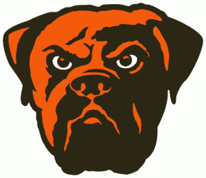
Well, he’s angry, at least.
Well. Whatever they actually flirted with as an official logo in 1965 can’t be any worse than those, right?

Presenting your local high school football team.
Yeesh. Go with the dog, guys. He’s much better.


